How to Build a Wardrobe Color Palette That Works
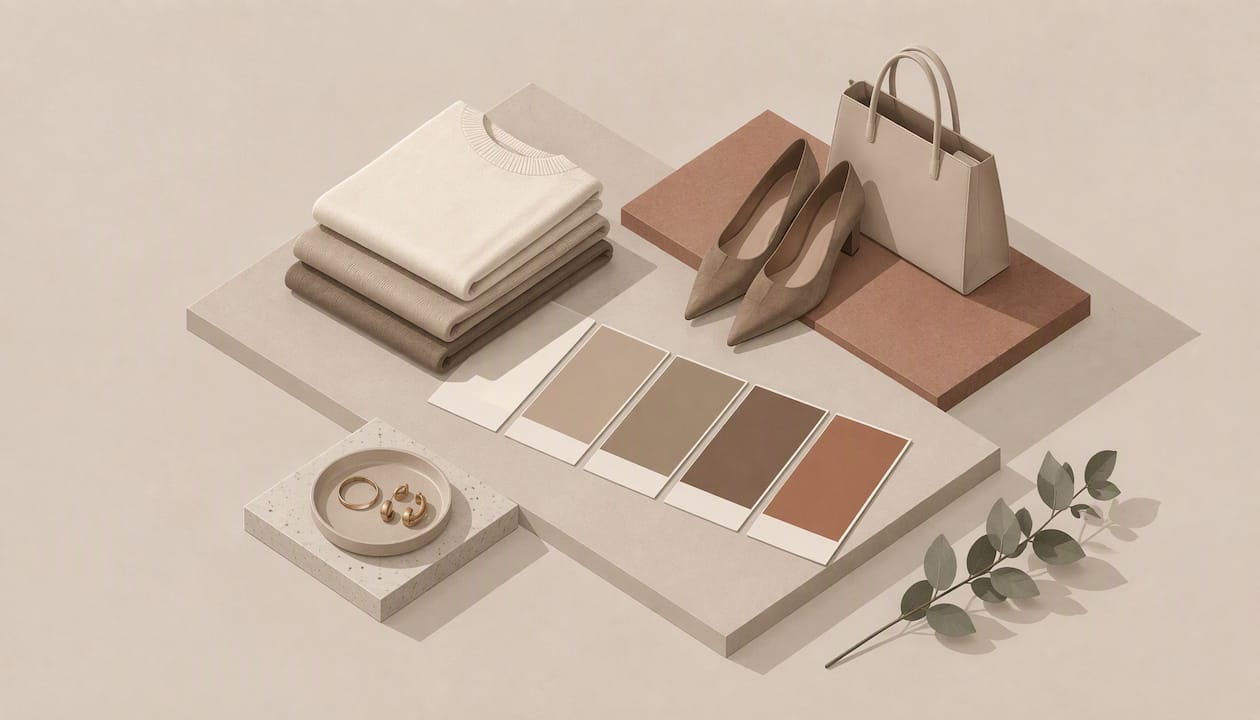
A wardrobe color palette is a short, deliberate list of colors that flatter you and mix with each other. You build it in three moves: work out which colors suit your skin, hair, and eyes, choose a few neutrals as the base, and add a small set of accent colors. Then you shop and get dressed from that list only. Below is the full method, including how to test your colors at home and how to keep the palette from turning into a rulebook you resent.
TL;DR
- Start with your own coloring. Skin, hair, and eye color guide which shades flatter you, and skin is usually the most important of the three.
- Test colors in good light, with a clean face and a plain neutral next to your skin. Lighting and fabric texture can change what you see.
- Build in layers: a few neutrals, a handful of main colors, and one or two accents. Make sure each new piece works with several things you already own.
- Use the palette as a filter for shopping and closet edits, not as a list of forbidden colors.
Table of Contents
- What a wardrobe color palette actually is
- Step 1: Find the colors that suit your coloring
- Step 2: Do your own color analysis at home
- Step 3: Build the palette in layers
- Step 4: Make the colors work together
- Step 5: Turn the palette into a capsule wardrobe
- Step 6: Use the palette to edit, shop, and plan
- Our perspective: a palette is a tool, not a verdict
- Let the closet do the work
- FAQ
- Sources
What a wardrobe color palette actually is
Most people do not have a color problem. They have a closet where a dozen unrelated colors each appear once. A black blazer, a rust sweater, a cobalt top, a gray skirt, and an olive jacket may each look fine on the hanger. Together they produce very few outfits, because nothing was chosen to go with anything else.
A palette fixes that by setting the rules before you buy. It usually has three tiers:
- Neutrals: the colors you wear most, often in bottoms, coats, and shoes.
- Main colors: the shades you wear in tops, knits, and dresses, usually near your face.
- Accents: brighter or more unusual colors for scarves, bags, jewelry, or the occasional statement piece.
This is also what people mean when they search for a color capsule wardrobe or a color-coordinated wardrobe. The look is not matching sets. It is a closet where most of the pieces can be mixed with most of the others.
Step 1: Find the colors that suit your coloring
Color experts start with the same three features. New Mexico State University’s extension guide says personal coloring rests chiefly on skin, hair, and eye color. Skin is usually the most important consideration, though unusually prominent hair or eyes can shift the emphasis.
More recent seasonal color analysis adds two refinements. AARP’s 2025 report on color analysis lists undertone and contrast level next to skin, eye, and hair color. Real Simple’s explainer describes value as the lightness or depth of your skin tone and intensity as the contrast between your features.
In plain terms, ask yourself four questions:
- Undertone: does your skin lean warm (golden, peachy) or cool (pink, rosy, bluish)?
- Depth: is your overall coloring light, medium, or deep?
- Contrast: is there a big difference between your skin, hair, and eyes (say, dark hair and fair skin), or are they all close in value?
- Intensity: does your coloring look soft and muted, or clear and bright?
You do not need a perfect label like “soft autumn” or “true winter.” The seasons are shorthand for answers to those four questions. If you land between two seasons, that is common and fine. You are building a wardrobe, not taking an exam.
Step 2: Do your own color analysis at home
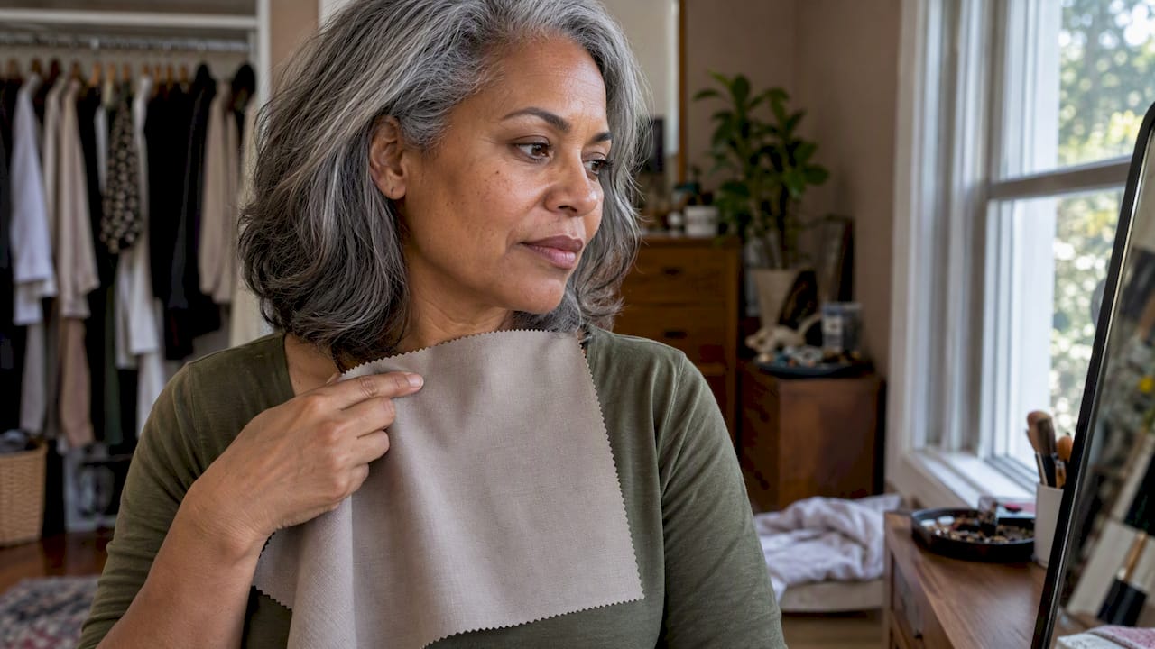
A professional drape session is not the only way in. You can run a decent version at a mirror in about 30 minutes. The method below follows the New Mexico State University guidance: check your skin without makeup, use natural or incandescent light, wear a light neutral or a white towel, and compare colors for their effect on your complexion, hair highlights, and eyes.
What you need
- A mirror near a window, or a room with warm incandescent bulbs
- A white or light neutral top or towel draped over your shoulders
- Ten to fifteen garments, scarves, or fabric swatches in different colors, including some you already love and some you avoid
- A friend, if you can get one, for a second opinion
How to run it
- Remove makeup and pull your hair back so it does not distract from your face.
- Drape the white or light neutral fabric around your neck and look at your skin first. Notice whether it looks even or sallow.
- Hold up one color at a time under your chin. Do not decide on the first glance. Look for three things: does your skin look clearer or more tired, do your eyes brighten or recede, and does your hair look richer or duller?
- Sort the colors into three piles: clearly good, neutral, and clearly unflattering.
- Look at the good pile as a group. Are those colors warm or cool, soft or bright, light or deep? The pattern is your palette direction.
If you want a second reference, a quiz or a color chart can help you name the pattern. Treat any quiz result as a starting hypothesis and check it against the mirror.
What can make the results unreliable
The usual culprit is light. University of Nebraska–Lincoln Extension notes that natural daylight is the best light for judging color, incandescent light adds yellow and red, and fluorescent light tends toward blue-green. New Mexico State’s guide likewise warns that fluorescent lighting can alter color. If your results look odd, move to a window and repeat the test.
Texture matters too. The same Nebraska publication explains that rough surfaces absorb light and look deeper and duller, while shiny surfaces look clearer and brighter. A navy wool sweater and a navy satin blouse will not behave the same way on your face, so test in the fabric you plan to wear when you can.
A few other traps:
- Reflected color. A bright red wall or a colored top underneath your drape tints your skin. Keep the background neutral.
- Judging by habit. If you have worn black for ten years, a softer charcoal may look “wrong” simply because it is unfamiliar. Look at what happens to your eyes and skin, not at how it feels.
- Using paint chips. AARP’s report quotes stylist David Kibbe on the value of fabric swatches: they are more reliable than paint chips because light reflects differently from fabric.
Step 3: Build the palette in layers
Once you know which colors flatter you, turn them into a working list. A practical structure is neutrals first, then main colors, then accents.
Choose your neutrals
Neutrals are the base of every outfit, so choose them for your coloring and your life. Nebraska Extension suggests starting with a few basic colors such as black, camel, or navy. If black is harsh on you, deep navy, charcoal, or chocolate brown often does the same job more gently. If you suit warm colors, camel, cream, and olive may carry more of your closet. If you suit cool colors, gray, navy, and soft white tend to sit better.
British Vogue’s autumn capsule guide recommends a restrained base of white, neutrals, gray, black, and denim, with occasional bright accents added on top. Denim counts as a neutral for most people, which is useful: it is likely already in your closet.
It helps to treat neutrals the way you would approach an everyday scent: sample before you commit, and favor what you will reach for daily. The same logic appears in this piece on sampling and layering before buying. Hold the fabric near your face, wear a sample piece for a day, and see whether it earns its place.
Add main colors
Main colors are the shades that make the closet feel like yours: the sweaters, blouses, dresses, and jackets you wear nearest your face. Choose a handful from the good pile in your home analysis. Pick colors that sit well beside your neutrals, so a teal knit works as easily with your jeans as with your charcoal trousers.
Add one or two accents
Accents are the colors you enjoy but may not want in large amounts: a mustard scarf, a fuchsia bag, an emerald earring. Because they are small, they are low risk and easy to swap. The Strategist’s stylists, in their piece on building a packable wardrobe, suggest that if a bright top feels overwhelming, you can introduce bold color first through outerwear or accessories.
How many colors in total?
There is no official number, and no university or professional body sets one. We find a palette gets unwieldy past about a dozen colors, and that a closet built on three or four neutrals, a handful of main colors, and one or two accents is easy to mix. If you have fewer colors and more outfits than you expect, you are on the right track.
| Tier | What it covers | Typical pieces | Aim for |
|---|---|---|---|
| Neutrals | Your base colors | Trousers, jeans, coats, shoes, belts | 3 to 4 |
| Main colors | Colors that suit you near the face | Knits, blouses, dresses, jackets | A handful |
| Accents | Brighter or special colors | Scarves, bags, jewelry, one statement piece | 1 to 2 |
Step 4: Make the colors work together
A palette only helps if the colors combine well. The Nebraska publication describes three core dimensions for selecting and combining wardrobe colors: hue, value, and intensity. It also recommends three simple harmonies:
- Monochromatic: different shades of one color. AARP reported in May 2026 that dressing in one color from head to toe creates a polished, uninterrupted effect, and that it works in browns and blues as well as black.
- Analogous: colors that sit next to each other on the color wheel, such as blue with teal or red with orange.
- Complementary: colors opposite each other, such as blue with orange. These are the boldest pairings, so use them in small doses.
The same source offers a useful trick for colors that are right in theory but not flattering on you: wear them away from the face. A less-flattering shade in a skirt, shoes, or trousers does little harm, while the shades that suit you sit near your face.
If you want ready-made examples, our guide to outfit color combinations you can actually wear shows pairings in real outfits rather than on a wheel.
Step 5: Turn the palette into a capsule wardrobe
A palette makes a capsule easier because it already tells you which pieces belong together. Two ideas help.
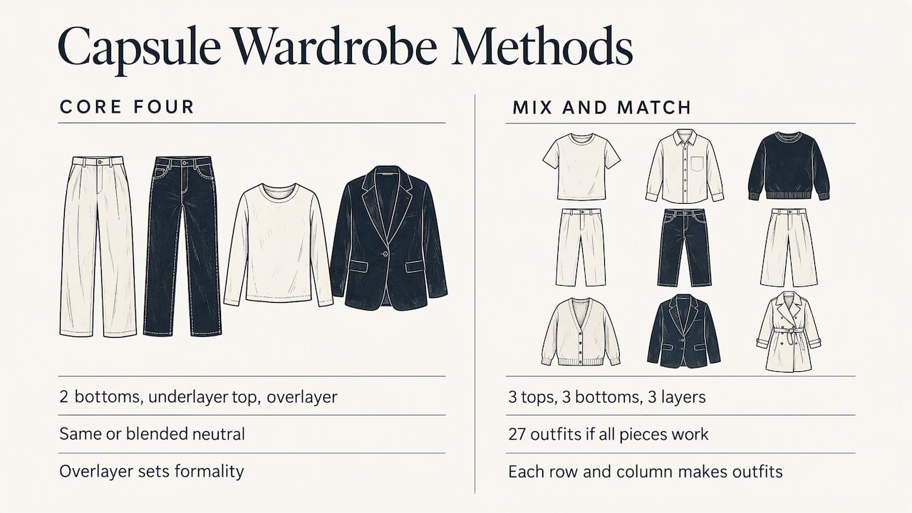
The first is the core four. Threads magazine describes it as two bottoms, an underlayer top, and an overlayer in the same or closely blended neutral, personalized to your needs and style, and tested so they work in every combination. It adds that the bottoms can be trousers, jeans, skirts, or climate-appropriate shorts, and that the overlayer sets the formality.
The second is a mix-and-match check. The Strategist described a method with three tops, three bottoms, and three layering pieces, where each row and column forms an outfit, giving 27 possible combinations when everything works together. You do not need to follow it exactly. The principle is to test every combination, because outfits can look different on the bed than on your body.
On the question of beige minimalism, the same stylists argue that a capsule works when every item can combine with the others, and accents can supply personality. A capsule does not have to be dull. Modern Retail reported that capsule wardrobes commonly use neutral hero items that dress up or down, paired with patterned accessories or varied textures. It also quoted a Stitch Fix stylist describing a capsule as an efficiency system aimed at maximizing cost per wear.
For a full walkthrough using the clothes you already own, see our guide to a capsule wardrobe for women built from your closet. If you wear a larger size, our plus size capsule wardrobe guide covers fit alongside color.
Step 6: Use the palette to edit, shop, and plan
This is where the palette pays off. Nebraska Extension recommends relating wardrobe colors to your personal coloring and lifestyle, because it can save shopping and dressing time and reduce unsuitable purchases.
Edit what you own
Pull everything out and sort by color. Keep what is in your palette and fits. Set aside what is off-palette but loved, and try it near your face in daylight. Often a color you assumed was wrong is just in the wrong fabric or the wrong place on your body. Our wardrobe audit guide has a step-by-step version of this edit.
After sorting, you will see your gaps. You might have six tops in your main colors and nothing in a second neutral for bottoms. That gap list is your shopping list.
Shop with a filter
Before buying, ask three questions:
- Is it in my palette, or an accent I chose on purpose?
- Does it work with at least three things I already own?
- Is the fabric right? Rough or matte fabrics look deeper and duller; shiny ones look brighter.
Carry a fabric swatch or a photo of your core pieces. AARP reported that Kibbe advised carrying fabric swatches to compare against clothes under store lighting, since store lights are rarely the lights you wear them in.
Plan outfits
Once the colors are limited, planning gets quicker. Our weekly outfit planning system and the five-minute work wardrobe method both rely on a shortlist of colors that already match. For evenings, the day-to-night styling formula shows how to shift the same palette from office to dinner.
Our perspective: a palette is a tool, not a verdict
After more than 20 years of styling women’s wardrobes, we have seen the same pattern many times. A woman learns her season, buys a stack of “right” colors, and then feels boxed in. The palette should do the opposite. It should make your decisions faster and your closet calmer.
We treat color analysis as one input among several. Your coloring tells you which shades are likely to flatter. Your life tells you which of those you will actually wear. A palette full of pale pastels does not help if you commute in the rain and spend your days with toddlers. A palette that feels right in the mirror but does not fit your work, your climate, or your budget will sit in the closet.
For that reason, we recommend three habits. First, test in real light and real fabric, not on a screen. Second, put your best colors near your face and let the weaker ones live in skirts, shoes, and trousers. Third, leave room for one color you simply love, even if no chart agrees. Style stays personal when you keep an exception on purpose.
If you want more of this thinking, what two decades as a stylist taught me about personal style goes further, and personal style after 40 covers how coloring and taste shift over time.
— Wendy
Let the closet do the work
If you would rather not sort piles by hand, that is what we built Style To Cart for. It is a fashion technology platform for women that lets you assess your closet virtually, spot the gaps, find new ways to wear what you own, and shop more strategically. It takes the personal consultations Wendy has run for years and makes them available as software. You can read more about how the platform grew out of her styling work.
FAQ
Which color is best for a wardrobe?
There is no single best color, because the answer depends on your coloring and lifestyle. Basic colors such as black, camel, or navy are common bases, and which suits you best depends on your skin, hair, and eyes. Pick two to four neutrals you can wear most days, then add colors that suit you near the face.
How do I know which color palette I should wear?
Look at your skin, hair, and eye color, then compare colors against your face in natural light. Note which ones make your skin look even and your eyes brighter. The group of colors that keeps winning is your palette, and seasonal labels like spring or autumn are just a way to name it.
Can I do color analysis at home?
Yes. Wash off makeup, sit by a window or under warm incandescent light, and drape a white or light neutral fabric over your shoulders. Hold colors up one at a time and compare their effect on your complexion, hair, and eyes. Avoid fluorescent lighting, which can alter color, and repeat the test on another day if the results are unclear.
What is the 3-3-3 rule for a wardrobe?
The label is informal and different writers define it differently, so there is no official version. A common idea is a small set of tops, bottoms, and layering pieces that all mix with each other. The Strategist’s version uses three tops, three bottoms, and three layers for 27 combinations, and works only if every piece goes with the rest.
How many colors should a wardrobe palette have?
No authority sets a number. In our experience, three or four neutrals, a handful of main colors, and one or two accents is easy to manage. If you cannot make at least three outfits from any new piece and your existing clothes, the palette is probably too wide.
Sources
- Determining Personal Colors, New Mexico State University
- Analyzing Color in Your Wardrobe, University of Nebraska–Lincoln Extension
- How to Use Color Analysis to Find Your Best Shades, AARP
- Not Sure What Colors Flatter You Most?, Real Simple
- Foolproof Fashion Tips That Make Getting Dressed Easy, AARP
- Sew a Core 4 Capsule Wardrobe, Threads
- The rise of the capsule wardrobe, Modern Retail
- How To Create A Polished Autumn Wardrobe, British Vogue
- The Sudoku Packing Method, New York Magazine’s Strategist
- Sampling and layering before buying
Recommended
About Wendy
Wendy Pilch is an award-winning wardrobe stylist, entrepreneur and Founder & CEO of Style To Cart. After more than 20 years of helping women build wardrobes and define their personal style, Wendy is bringing that experience to fashion technology.