10 Outfit Color Combinations You Can Wear, Not Just Study
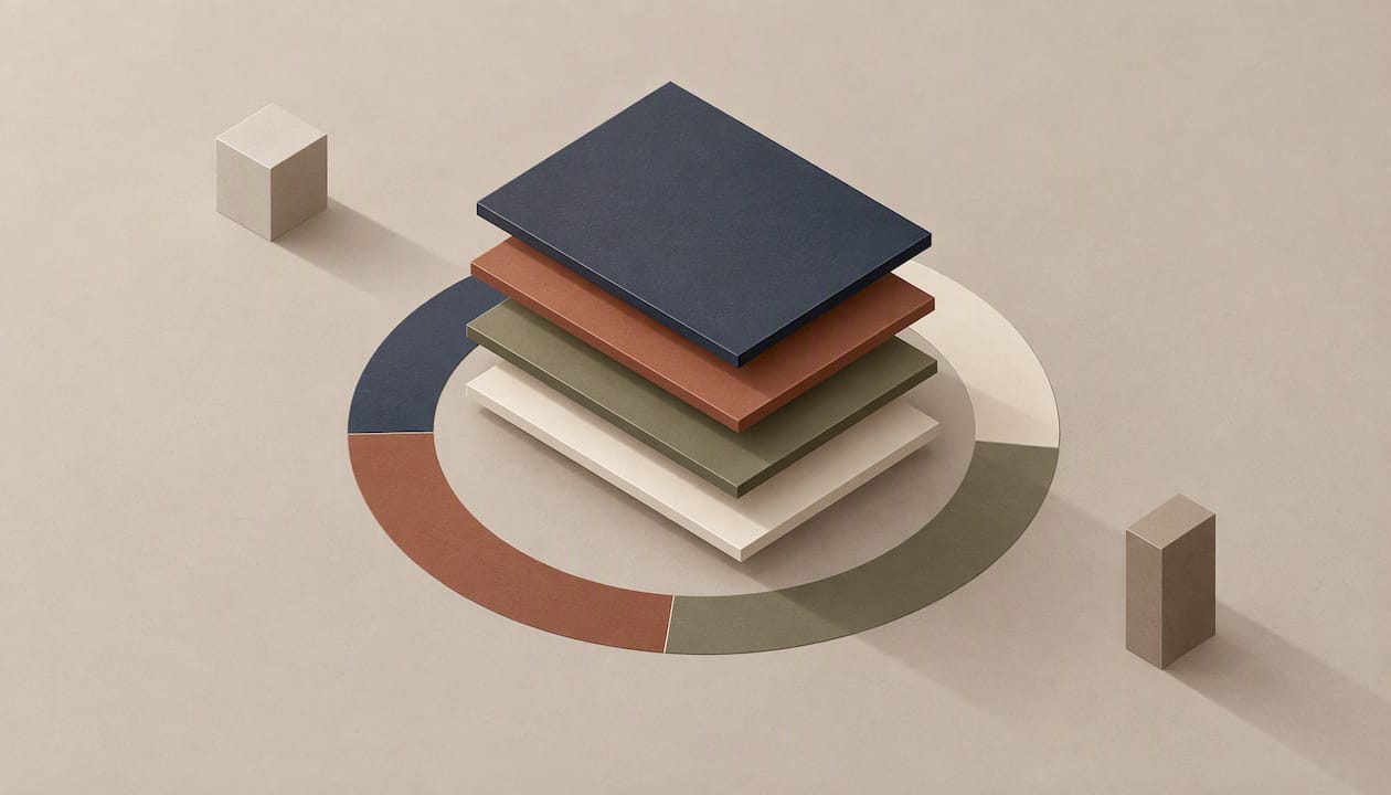
Anchor your outfit in a neutral, add one or two accent colors, and let a simple proportion guide set the balance. Navy with rust, charcoal with blush, and camel with white and an olive accent all work the moment you put them on. Below you’ll find wearable outfit recipes first, then the short color theory behind them.
TL;DR:
- Let one color dominate, use another for support, and reserve the smallest share for an accent; reliable neutrals include navy, camel, gray, and olive.
- Warm undertones suit rust, olive, mustard, and cream; cool undertones favor navy, plum, emerald, and true white, but treat both palettes as starting points.
- Mute complementary colors to soften contrast: navy with dusty rust and sage with soft terracotta are easier to wear than bright opposites.
- Keep trend shades in inexpensive accessories, not investment pieces; Pantone’s 2026 pick, Cloud Dancer, acts like a soft white neutral.
Table of Contents
- 1. Which outfit color combinations are worth wearing first?
- 2. What color theory do you actually need to know?
- 3. How do neutrals and the 60-30-10 rule balance an outfit?
- 4. How do undertones and seasonal palettes make colors flatter you?
- 5. What stylist shortcuts make color combos work in a real wardrobe?
- 6. How do fabric texture and patterns change color combinations?
- 7. How can you wear trendy colors and still keep a timeless wardrobe?
- 8. How do you transition color combinations from season to season?
- 9. How should you accessorize to complement a colored outfit?
- 10. What are the most common color-matching mistakes, and how do you avoid them?
- 11. Why do simple color rules beat trend-chasing?
- 12. How does Style To Cart help you apply these combos to your own closet?
- FAQ
- Sources
1. Which outfit color combinations are worth wearing first?
Start with these pairings. Each one gives you a recipe and a reason, sorted by occasion.
- Work: navy + rust. Navy trousers, a rust knit, brown leather loafers. A muted complementary pair gives you contrast without neon intensity, as muted complementary pairings like navy with rust show.
- Work: charcoal + blush. Charcoal blazer over a blush blouse, gray flats. The soft pink warms up a serious neutral.
- Work: camel + white + olive. Camel trousers, a white shirt, an olive scarf or belt. Two quiet neutrals carry one small accent.
- Casual weekend: denim + cream + mustard. Mid-wash jeans, a cream sweater, a mustard bag. Blue and yellow-orange sit opposite each other, and cream softens the meeting.
- Casual weekend: gray + sage. Heather gray sweatshirt, sage green joggers or a sage jacket. Both colors are low in saturation, so nothing fights.
- Evening: black + emerald. A black dress or trousers with an emerald top or wrap. Deep jewel tones look rich against black.
- Evening: burgundy + gold. A burgundy dress with gold jewelry. The metal does the second-color work for you.
- Statement: cobalt + camel. A cobalt coat over a camel knit. A bold color stays wearable when the base is warm and neutral.
- Statement: olive + pink. Olive utility pants with a bright pink tee. Olive behaves like a neutral here, so the pink can be loud.
- Capsule neutrals: ivory + taupe + black. Ivory top, taupe trousers, black shoes. Vary the depth of the tones and the look stays interesting without a single bright color.
2. What color theory do you actually need to know?
You need four palette types, and all of them start with the color wheel, the circle that arranges hues so you can see which ones sit near or opposite each other. Vogue’s guide to color theory in clothing covers how fashion editors use these palettes to build wearable looks.
Monochromatic means one hue in several tones. Think a pale blue shirt, mid-blue trousers, and a navy jacket. It reads long and polished.
Analogous uses neighbors on the wheel. A mustard top, an olive skirt, and a rust jacket sit close together and feel cohesive without matching.
Complementary pairs colors from opposite sides, like orange and blue. Complementary colors also include red with green and yellow with purple. In clothing, mute them: a denim jacket with a terracotta tee.
Triadic uses three colors spaced evenly around the wheel. In an outfit, that might be a teal top, a mustard bag, and a plum scarf. Keep one color dominant and the other two small.
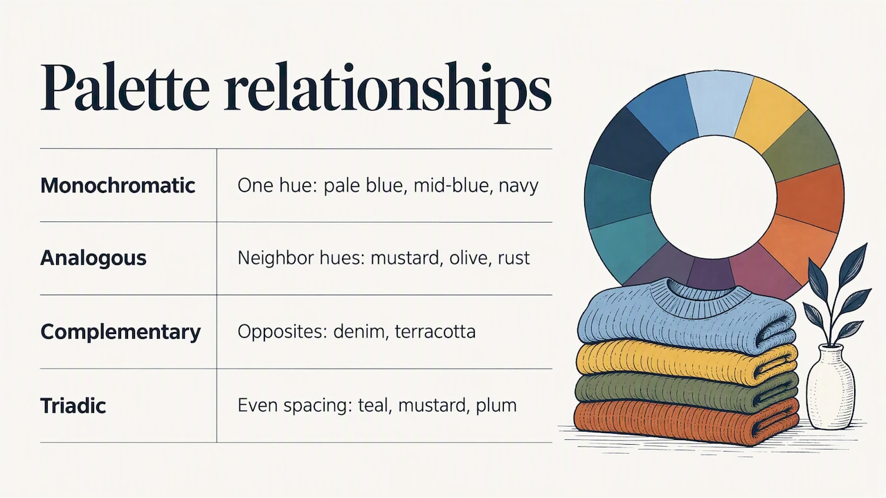
The wheel is also why color psychology matters to dressers: colors interact, and the same shirt looks different next to different partners.
3. How do neutrals and the 60-30-10 rule balance an outfit?
A proportion guide splits your outfit by visual weight, giving the dominant color the largest share, the secondary color a smaller share, and the accent the smallest share. It’s the fastest way to make a color combination look planned rather than accidental.
Two examples:
- Camel coat and trousers, cream knit, cobalt scarf.
- Charcoal dress, blush cardigan, gold earrings and a brown belt.
Reliable neutrals include black, white, ivory, gray, navy, camel, taupe, and olive. In color-theory terms, black, white, and grays are achromatic, which is why they anchor almost any palette.
- Pair navy with any warm accent: rust, mustard, coral.
- Pair gray with soft pink, sage, or lavender.
- Pair camel with cobalt, white, or deep green.
Pro Tip: To tone down a bold combo, swap one loud piece for a neutral and keep the bright color to a bag, scarf, or shoes.
4. How do undertones and seasonal palettes make colors flatter you?
Colors look best when they echo your skin’s undertone, either warm (golden or peachy) or cool (pink or blue). Vogue summarizes how seasonal palettes map skin undertones to recommended colors, which gives you a starting point rather than a rulebook.
Warm undertones usually glow in rust, olive, mustard, and cream. Cool undertones tend to favor navy, plum, emerald, and true white. Many of us land somewhere in between, so treat these as leanings.
Muted versions of complementary pairs are the most forgiving. Navy with a dusty rust, or sage with a soft terracotta, keeps contrast without overpowering your coloring.
Two quick checks:
- Vein color: greenish veins suggest warm, bluish or purplish veins suggest cool.
- Jewelry metal: if gold flatters you more, lean warm. If silver does, lean cool.
5. What stylist shortcuts make color combos work in a real wardrobe?
These come from Wendy Pilch’s wardrobe styling experience, where the same fixes come up again and again:
- Start with a neutral anchor. Build from trousers, a skirt, or a coat you already trust.
- Repeat a color twice. A rust belt echoing a rust sock ties a look together.
- Add texture before color. A chunky knit in gray adds interest without another hue.
- Place accessories to echo your accent. Earrings, a bag, or shoes that repeat the accent pull the eye around the outfit.
- Try before you buy. A virtual closet review lets you test combinations using pieces you already own.
Pro Tip: Photograph your outfit before you leave. Photos show clashing tones and uneven proportions that a mirror hides.
6. How do fabric texture and patterns change color combinations?
Texture changes how a color reads. A matte wool in navy looks softer and deeper than navy satin, which catches light and appears brighter. When two colors are close in tone, a texture contrast keeps them from going flat: cream cotton against cream cable knit looks rich, not dull.
Shiny fabrics amplify color. Silk, satin, and sequins make a bold shade feel bolder, so pair them with quieter, matte pieces. Rough textures such as tweed, linen, and corduroy mute a color and make it feel earthy.
Patterns follow the same logic of balancing dominant and supporting colors. Pick a pattern that contains your outfit’s colors, and let those colors do the matching. A plaid skirt with rust, navy, and cream lines pairs naturally with a solid navy sweater and a rust belt.
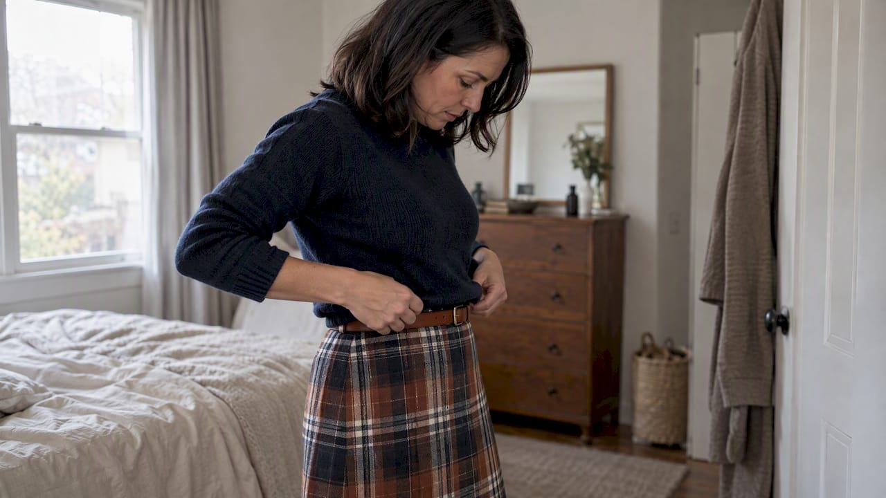
Mixing two patterns works when they differ in scale and share a color. Wide stripes with a small floral print, both containing navy, look intentional. If you’re unsure, keep one pattern as the star and make everything else solid. Busy prints in many colors usually need the plainest neighbors, usually a neutral that already appears in the print.
7. How can you wear trendy colors and still keep a timeless wardrobe?
Treat a trend color as a small accent, not the dominant color. A trending shade on a scarf, bag, or a pair of shoes costs little and leaves your core wardrobe untouched. When the trend fades, you swap one item.
Each year Pantone names a Color of the Year, and for 2026 that color is PANTONE 11-4201 Cloud Dancer. It’s a soft, airy white, which makes it easy to try: it behaves like a neutral and sits comfortably next to navy, camel, olive, and charcoal.
A few ways to use any trend color without committing:
- Wear it in one small, repeatable place, like a bag strap or a knit.
- Pair it with a neutral you already own, so the outfit has an anchor.
- Choose a trend shade that sits near your undertone, then adapt it: a warmer or cooler version of the same hue often exists.
- Buy trend colors in inexpensive categories (scarves, tees, accessories) and keep investment pieces in classic shades.
If you try a trend color and don’t reach for it again within a few weeks, that’s useful information. The colors you wear on repeat are your real palette. Let trends borrow space in it, not take it over.
8. How do you transition color combinations from season to season?
Move your palette gradually by keeping the anchor and changing the accent or the weight of the fabric. A navy and white summer outfit becomes navy and cream in fall, then navy and burgundy in winter. The base barely changes, so your wardrobe keeps working.
Light, cool, and pastel shades feel like spring and summer. Deep, warm, and earthy shades feel like fall and winter. But you don’t need to swap everything on the first cool day. Introduce the next season’s colors in small doses.
- Spring to summer: shift from soft pastels to brighter, lighter tones. Swap a lilac cardigan for a white linen shirt over the same trousers.
- Summer to fall: add warmth. Keep your white or denim, then layer in rust, mustard, or olive.
- Fall to winter: deepen everything. Burgundy, forest green, and charcoal replace the lighter earth tones.
- Winter to spring: lighten gradually. Keep a camel or gray coat, but wear it over a pale blue or blush top.
Layering is the easiest bridge. A coat or jacket in a neutral lets you wear last season’s colors underneath while the outer layer anchors the outfit. Footwear also carries a season: suede boots in brown or taupe say fall even with a summer dress.
9. How should you accessorize to complement a colored outfit?
Accessories are where you add or echo color without changing the outfit. The most dependable method is repetition: pick one color already in your clothes and bring it back in a bag, scarf, shoes, or jewelry.
For a neutral outfit, an accessory is your accent. A camel and cream look gains life from a cobalt bag. For a colorful outfit, go the other way and keep accessories quiet: black, brown, tan, or a metal that suits your undertone.
- Shoes and belt: match them to each other, or to your bag, and the look feels pulled together.
- Metals: gold warms olive, rust, and mustard. Silver cools navy, gray, and plum. Mix them only if one piece bridges the two, like a two-tone watch.
- Scarves: a scarf is the cheapest way to try a new color near your face, so test trend shades there first.
- Bags: a colored bag against an all-neutral outfit makes a clear 10 percent accent.
Watch for competing statements. If your shirt is bold, one standout accessory is enough. Three bright accessories fight each other and turn a combination into a crowd.
10. What are the most common color-matching mistakes, and how do you avoid them?
Most mistakes come from too many competing colors, or colors too close to call. Here’s what we see most and the quick fix for each.
- Too many colors at once. Stick to a neutral plus one or two accents. A proportion guide helps keep the color balance in check.
- Pairing full-strength opposites. Bright red with bright green looks like a costume. Use muted versions, like dusty rust with navy.
- Near-matches that clash. Two blacks or two navies that don’t quite match look like an error. Either match them exactly or separate them with a clearly different color.
- Ignoring undertone. A shade that fights your coloring will make you look tired, even in a good combination. Test colors near your face.
- Forgetting proportions. Equal amounts of two strong colors split the outfit in half. Let one lead.
- Skipping texture. A flat, single-fabric outfit can look dull. Add a knit, a leather belt, or a structured jacket.
- Letting trends override fit and comfort. A color you love but never wear is a closet decoration.
A fast check before you leave: squint at your reflection. If one thing jumps out unintentionally, either lean into it with an echo elsewhere, or swap it for a neutral.
11. Why do simple color rules beat trend-chasing?
I’ve watched a lot of closets, and the women who dress easily are rarely the ones following every color forecast. They have two or three neutrals they trust, a handful of accents they love, and one proportion rule. Trend colors and the annual Pantone pick are good prompts for a scarf or a sweater, but they aren’t wardrobe law. Simple rules compound: every new piece fits the closet you already have.
— Wendy
12. How does Style To Cart help you apply these combos to your own closet?
We built Style To Cart so you can test these color combinations on the clothes you already own, instead of guessing in front of the mirror. Here’s what we offer:
- Virtual closet assessment, so you see what you have in one place
- Outfit planning that shows new ways to wear existing pieces
- Wardrobe gap identification, so you only buy what the closet needs

Learn how we work on Wendy Pilch’s founder page, or read the story behind Style To Cart, then start a virtual closet review and put your first color recipe together today.
FAQ
What colors look best together in an outfit?
A neutral plus one or two accents looks best together. Navy with rust, charcoal with blush, and camel with cream and olive are dependable pairings. Muted complementary colors give contrast without feeling loud.
What colors are fashionable for 2026?
Pantone named PANTONE 11-4201 Cloud Dancer as its Color of the Year 2026. It’s a soft white, so it pairs easily with most neutrals and accents. Trend colors work best as small accents, not whole outfits.
What are Gen Z colors?
There’s no single official Gen Z palette. Trend reports vary, so treat any list as a prompt rather than a rule. The safest approach is to pick a trending shade you like and use it as your accent against a neutral base.
What does color combo mean?
A color combo is a planned pairing or grouping of colors in one outfit. Fashion editors build them from palette types like monochromatic, analogous, complementary, and triadic, as Vogue’s color theory guide explains. A good combo usually has one dominant color and one or two supporting ones.
Sources
About Wendy
Wendy Pilch is an award-winning wardrobe stylist, entrepreneur and Founder & CEO of Style To Cart. After more than 20 years of helping women build wardrobes and define their personal style, Wendy is bringing that experience to fashion technology.